2.2.2 Add and delete vertical space in measured intervals
“Headings, subheads, block quotations, footnotes, illustrations, captions and other intrusions into the text create syncopations and variations against the base rhythm of regularly leaded lines. These variations can and should add life to the page, but the main text should also return after each variation precisely on beat and in phase.”
The most common addition of vertical space on a webpage is that inserted between paragraphs. If the rhythm of the page is to be maintained, the spacing of paragraphs should be related to the basic leading. For example, the text on this page is set at 12 px with a line-height of 1.5 em, making each line 18 px in height. In order to keep the rhythm of the text, the vertical spacing between blocks should also be 18 px. This is achieved by setting top- and bottom-margins equal to the line height.
p {
  line-height: 1.5;
  margin-top: 1.5em;
  margin-bottom: 1.5em;
}
It should be noted that the default treatment by web browsers of paragraphs (and other block level elements such as blockquotes and lists) is to insert a top- and bottom-margin of 1 em. The implication is that margins must always be specified by the designer.
Variations in text size
When there is a change in text size, perhaps with a heading or sidenotes, the differing text should take up a multiple of the basic leading. As stated earlier, each line on this page is 18 px in height. This means that every diversion from the basic text size should take up multiples of 18 px. This can be accomplished by adjusting the line-height and margin accordingly.
Headings
The subheadings on this page are set to 14 px. In order that the height of each line is 18 px, the line-height should be set to 18 ÷ 14 = 1.286. Similarly the margins above and below the heading must be adjusted. The temptation is to set heading margins to a simple 1 em, or leave them at the browser default, but this would usually result in breaking the rhythm of the text. In the case of this page, the top and bottom margins are the same size and equal to a full line, so they too should be set at 1.286 em.
h2 {
  line-height: 1.286;
  margin-top: 1.286em;
  margin-bottom: 1.286em;
}
One can also set asymmetrical margins for headings, provided the margins combine to be multiples of the basic line height. For example, a top margin of 1½ lines could be combined with a bottom margin of half a line as follows:
h2 {
  line-height: 1.286;
  margin-top: 1.929em;
  margin-bottom: 0.643em;
}
By way of a further example, the main heading of the page you are reading has a text size of 18 px, therefore the line-height is set to 1 em, as are the margins.
Sidenotes
Sidenotes (and footnotes for that matter) are often set at a smaller size to the basic text. This smaller text should still form a rhythm with the basic text, so a calculation similar to that of headings, is required. Consider the following example:
Daniel is roused by a rooster on the forecastle* deck that is growing certain it’s not just imagining the light in the eastern sky. Unfortunately the eastern light is off to port this morning. Yesterday it was to starboard. Minerva has been sailing up and down the New England coast for the better part of a fortnight, trying to catch a wind that will decisively take her out into the deep water.
The forecastledeck is the short deck that, towards the ship’s bow, is built above the upperdeck.
The main body text again has a text size of 12 px and a line height of 18 px. The sidenotes are set at 10 px and so their line-height must be increased to 18 ÷ 10 = 1.8.
Images
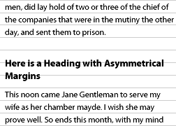
On the Web, images in sidebars and within the main body of text are almost always guilty of disrupting the rhythm of text. The same rules should be applied to images as to headings: any image and associated caption should take up multiples of the basic line height. For example the image on this page demonstrating asymmetrical headings is 180 px tall – precisely 10 lines in height.
Clearly problems would arise when the basic text size changes, for example if a reader changes their default text size. In this situation, if the image is left at its natural size, or has a specific size set in pixels, the image would no longer take up a multiple of the basic line height. This could be avoided if the image is sized in ems rather than pixels. For example, the aforementioned image could be given a height of 180 ÷ 12 = 15 em (12 px being the text size).
Sizing images in ems rather than pixels means that they scale up and down with the text size. It is acknowledged, however that this will result in some loss of image quality which may or may not be acceptable. The alternative is to keep the images sized in pixels, and accept that the small proportion of readers who resize their default text size will receive a sub-optimal reading experience.